I remember when I was in college; I had a fantastic photography teacher, who used to take us on field trips. On occasion, he would let out a scream as if he was having a heart attack often causing near heart attacks in the group as a result. Suddenly out of nowhere, he’d shout “OHHHHHH, My God!” he’d then tell the group to “look at that!” What he was seeing was texture on a wall, or shadows that formed a three dimensional picture in his mind. His name was Hugh Rogers and he became a mentor to me. He taught me not to see light but to see texture in light. To this day I have used his guidance and see qualities in light that others can see too, but mostly unconsciously. While they know something I light looks good, they often don’t really understand why. As long as it looks good, it matters not.
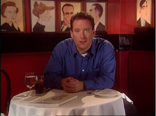
I thought I’d show you were texture comes in to play in what might be considered a pretty standard set-up. Imagine your talent is in a famous restaurant. The atmosphere is supposed to be an evening dinner after a long day of work. I want to make him and the setting appealing. So instead of firing as much light on him as possible, I use texture to give the scene it’s appeal. That involves placing lights in places they might not normally be placed at, using streaks of light instead of big ‘light box” types of fixtures, and adding color to accentuate the scene. The photo below is a final frame of what I was trying to achieve. If you can’t see all the texture I was trying to create let me point it out and show you how I did it.
Now, if you don't see the texture, let me point it out with a marked up version.
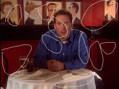
As you can see when you compare the two photos above, there are ‘streaks and tips of light hitting both the talent and the setting. I could have set up a single fixture to his left and lit both him and the walls but then I wouldn’t have all the texture I get when I light the shot this what. What did I do differently?
Here is the lighting plot shown visually by widening out.
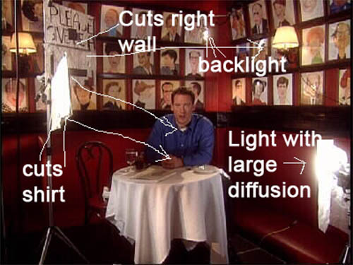
First off, I am using primarily one key light for lighting the talent and the wall but the light is a 600 watt open-face fixture about twenty feet away with no diffusion on it. In the photo above it is out of frame to the left. I said it was 20 feet away, why? Because the farther away the source the more I can use cutters to cut specific areas of light with sharper precision. Moving a light closer makes shadow edges softer, while moving it away makes shadow edges shaper. I start with a cukoloris that breaks up the light on the wall and the talent (Also just out of frame on the left). It's the same kind of home-made cut out you've seen me use in other articles. Then I take strips of foam-core and break up the light even more creating a balance of streaks and tips (marked cuts shirt and cuts right wall above). I do make sure the talents face has a relatively shadow-free spot hitting him as you can see from the circle that shows the highlight on his face in the upper picture. Overall the idea is to have soft and hard spots of light that have very soft delineations. It's sort of like what a tree branch does to light, allowing some through and creating dark areas. I try to create a randomness to it but at the same time make sure what needs to be in the light is. What you do see in the photo immediately above is a stand with a number of foam core cutters on it. Where it says cuts right wall, I am using the piece of foam core to block light from hitting the wall on the right so that the streaks and tips of light from the cukoloris can do their thing. Where it says cuts shirt, I am also preventing the shirt from being illuminated too much form the key light.
Notice how the light hitting his shirt on the first photo creates many subtle shadows. His shirt has texture instead of being a mass of blue color. A backlight is directly above and behind him and on a dimmer (200 watt MR16 Cool Lux attached with a photo clamp) so that it creates a nice back light. I like very defined back lights in restaurants and really any dining scenes. It is an industry standard. His fill side (right side of frame) is lit from a small 200 watt fresnel fixture except that it is placed deliberately below the table height and not above it striking his face very much opposite the key light creating a subtle diagonal of light across his face. It also has a very oversized piece of 216 diffusion on it to break the light up differently than if I had cut a piece the size of the fixture. And the light texture on the wall has some light salmon colored gel to blend the light more into the background. Sorry, I lost some of the stills I took so I haven’t much more to offer.
Look at this as a Venetian blind type of effect but an effect that isn’t on one part of the wall but throughout the entire shot and more subtle than most folks really notice.

Once again, take a moment to look at the photo above and notice the texture of light throughout the shot. It's the texture that creates the mood of a restaurant shot such as this.
Experiment with light. Cut some strips of foam-core. Make some homemade cut-outs and try putting them in front of lights and see what you get.
Copyright 2013 by Walter Graff. This article may be circulated and shared as long as the following reference is made: 'This article appears courtesy of Walter Graff- http://www.waltergraff.com'
Please don't hesitate to send me an e-mail if you have any questions or comments please e-mail me at Walter@waltergraff.com