Lighting five locations in a single room
by Walter Graff
This article is deticated to Mel Sachs, a famous criminal attorney from NY who passed away in 2006. Mel posed for the last picture in this article. He was a wonderful person.
When we shoot multiple interviews for one show, we don't want all the backgrounds to look the same. If they did, the show might not be as visually appealing. Shooting in five locations pretty much guarantees that all the scenes will look different. But what happens when you are asked to do five interviews in one hotel room? How do you achieve five distinct looks?
This is exactly what I was asked to do recently for an A&E show called Investigative Reports, hosted by Bill Curtis. You might ask why I didn't just arrange to shoot in five locations? The reason is that, from a producer's point of view, shooting in one room is practical and economical. It saves a lot of time and money to have all your talent meet you at central location (on a staggered schedule), rather than traveling all over the New York metropolitan area to five different locations. Now, a central location may be a plus from a producer's perspective, but what does it mean for the person who's shooting? I discovered that with some imagination and proper technique you can pull it off.
The location picked for my interviews was a suite at the Waldorf-Astoria Hotel. I was happy to hear this. If you've never been to the Waldorf, I should tell you that it has one thing going for it that most hotels don't: each room has a lot of furniture and a wide variety of paintings on the walls. This makes for lots of choices in backgrounds. On the other hand, each room usually has a unified color motif. In my case it was blue--as in blue wallpaper with blue curtains. But as you will see, I did not let this be an obstacle.
When I first walk into a room like this, I look for an area in which I know I will not be shooting. In this case, the room layout was as follows. One wall had a fireplace and small built-in bookcase. The second wall had a window and a desk. The third wall had two windows and a hutch and the forth wall was completely mirrored. I decided that the mirrored wall was not going to come into play so I set the camera up between it and the wall with the windows and hutch. That left me two walls for shooting. I mentally scanned the room and figured out five possible backgrounds for my interviews. I always remember one important thing about picking a background-you don't need much. In an interview situation, you probably need no more than a 3x3-foot patch of wall. Too often I see producers walk into rooms and notice everything from cracks in the ceiling paint to dirty wall outlets. I often remind them not to look at the 'big picture' since we only need a small portion of the wall.
Having narrowed down the five locations in my head, I now decided to shoot from the first location I picked. Each progressive interview would be a lateral move across the walls using various elements of the wall and props in the room for each background. By keeping things organized, all I would have to do for each set-up would be to move my lighting fixtures minimally and move the camera no more than a foot as I move across the wall. Doing the interviews this way would save quite a bit of time between set-ups. If I hadn't shot each interview sequentially along the wall, I would have made more work for myself moving the fixtures all over the room and having to reposition the camera.
1:Using depth of field
One of the advantages to shooting with film is depth of field. In general film has a short depth of field and video has a much longer depth of field. In other words, the focus in film is more critical. If you have an over-the-shoulder shot in film, the back of one person's head can be completely out of focus while the person facing the camera can be sharp. With this type of set-up on film everything is soft except the main area of concentration, which is sharp, and your attention is directed at the person speaking. (It's similar to the way we see. We have a 'sweet-spot' in our vision where our brain concentrates while the rest of our view is blurred.) The same over-the-shoulder shot done with a video camera would usually have both people in clear focus. This may not appear as desirable. But, there is a way to achieve a similar soft/sharp look on video.
Depth of field in video can be achieved in three ways. The first involves the aperture of the lens. The wider the aperture, the shorter the depth of field. The focal length of the lens also affects depth of field. The longer the lens, the shorter the depth of field. Finally, the distance of your subject to the background affects depth of field. I like to use a combination of all three methods to achieve a short depth of field with video. Picture number one is a perfect example. In this set-up, I am leaving the lens at f2.8. In addition the camera is nearly eight feet from the subject. This results in a longer focal length, which creates a shorter depth of field. Finally the subject is nearly six feet from the background. The combination of aperture, focal length and distance from the subject to the background guarantees a very short depth of field.
So just like short depth of field, which helps me to blur the background, color allows me to make a single room appear as if it's a different location. Basically I am using various shades of natural blue and orange in my background, which suggest different times of day. In Picture 1, I am using CTB. One thing I like to do in most all video head-shots is take color even further. I call it color contrast. This means I try to have opposing shades of color to balance out the frame. I normally don't like a shot to have a predominant color. In the case of picture 1 my talent has a red tone, while my background has a blue tone. Just to break it up, I added a practical fixture at the corner of the shot and dimmed it sufficiently to give me what I wanted without overpowering the shot. The fixture gives a bit more detail to the shot and creates a better balance of color contrast.
2:Breaking my own rule?
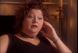
I know what you're thinking after looking at picture number 2. I just told you about using color contrast, but picture number 2 is all in the red range. Well, the number one rule of television is that no rule is written in stone. It's not about rules, it's about look. If something looks good in one picture, it may not look as good in another. One of the things I do when lighting a person is not to think of them as a just a body but rather as an element in a painting. There are two things I take into consideration when lighting someone in a room: sex and hair color. I tend to light women slightly different from men. A person's hair tells me a lot about skin-tone and appearance as a whole. Very simply, if someone has gray hair, odds are they have a fairer complexion. If someone has red hair, they probably have a light to medium tone. Of course this rule isn't written in stone, but when you're setting up lights for an interview with a person you haven't yet set eyes on, you have to have some sense of what you're lighting for so you can at least get in the ballpark.
Let's look at what I thought going into setting up for picture 2 versus what I ended up with. I was told the subject was a young, female school teacher. My first thought was that she would be a frail little woman, thin and rather pale. So I did the standard set-up, soft bounce from the side she was looking toward. I also set up a possible rim/backlight in case she needed it and clipped half CTB on the light stand in case blue worked better than orange, even though I had been told she had brownish hair and probably wouldn't need it. I also created a pattern on the wall that would break up the light to my liking. That fixture also had the option for either a blue cast or an orange cast depending on what she actually looked like and what she was wearing. Remember I said I had a vision of what I thought she looked like? Boy was I wrong. She was robust, had dyed reddish hair, and was wearing all black. Since I was setting up in the ballpark, and had left myself some options, I simply picked the option that worked. And guess what? After all was said and done, I didn't want any blue tones in the shot. There was something about her skin and the fact that she was wearing all black. When I tried blue, it simply didn't seem to work. I think in the end, I made a nice picture. In addition, it looked like a completely different location from the first shot.
3:It's all about balance
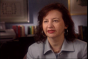
Sometimes I'll set up a shot where the talent's looking left and someone will ask me if it would be too much trouble for them to look right. The answer is that it depends. One of the most important factors deciding what side of the room a person looks toward are imaginary lines created by elements in the room and how the talent compliments those lines. If you've ever taken an art class you've learned about such things as the horizon and the imaginary lines that determine how big everything is in a picture based on how 'distant' they are from the viewer. In a similar way, when I look at a shot my mind begins to ask what direction the room seems to be pointing. Pointing? In a way that is hard to verbalize, I discover the balance of elements in a shot and I let the person become the element that balances all the other elements. Take picture 3. I dressed the background in a way that made me instinctively face the woman towards camera left. Could I switch her to camera right? I could, but if I did there would be too much information (the large picture, the books, the FAX machine) on one side of the frame and having her look from that side as well would seem like an imbalance to me. So when you look at a room, imagine what it would be like with your talent looking left, then right, and think about which direction seems to balance the weight of the shot.
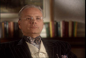
4:Black skin doesn't mean more light
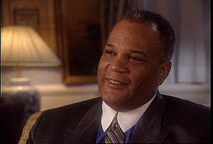
I am often asked how I light black skin differently from light skin. The answer is no differently. As I said before, I aim for synergy among all the elements of a shot, not just the person. Take picture 4 for example. If you had a waveform monitor showing you references of exposure you would find that in actuality the subject in this shot has been lit less than the subjects of the previous two pictures. My belief is that the subject does not need to be the brightest thing in the shot. In fact I rarely ever make the person the brightest element in any shot. Let's look at a waveform representation of picture 4:
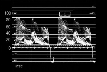
4A: Waveform of picture 4
One of my secrets to making video look like film is to use as much range of luminance in any picture as possible. It's important to remember one little secret: we see in black and white, and color information is added later. So when I light any scene, I have trained myself to see things in shades of gray. In other words, I light for contrast first and color second. In picture 4 I have as great a range of contrasts as I can, as observed on the waveform shot in picture 4A. Notice the waveform shows that I try to have as much tonality around the face as possible. There is a lot of information in the middle range of the shot. If I had put this subject in front of a white background, the waveform would show a spike of about 70 units where the face was, and the rest would be dark. If I put him in front of a white wall there would be a spike around 80 units representing the wall and a spike around 70 units representing the talent. In picture 4 I have complete tonality. Or put another way, there is lot's of gray value throughout the range of lightest lights to darkest darks. The picture directly behind the talent's head (the side he is facing) is darker than he is. This was done so as to separate him from the background. Too many times people put light colors behind dark skin causing competition between the lighting on the talent and the rest of the shot and creating the traditional scenario of lighting dark skin brighter than white skin. In picture 4 you'll notice a streak of blue light behind the right side of the subject's head. This gives him a bit of separation. Let me say again what I have said in many other articles: I am not a fan of bright backlights. They make as much sense as using a plant as a background. Most of the time these bright backlights make people look angelic. I try to light so that you can't tell I am lighting. If a person requires any back/rim lighting, I use it. Most of the time, however, it's unnecessary once one learns how to think of a picture as a whole rather than focusing on the talent as a separate element form the background. In this case I do have a slight rim light that is colored with � CTB. One of the best ways to light dark skin is to use some sort of blue in the background. It counters the appearance of redness and offers fantastic color contrast.
Let me also take a moment to discuss the talent's white collar. In fact, in my example I have what some may believe is the worst possible combination, black skin with a white shirt. We often hear the phrase 'never wear white on television'. I agree with this statement when you're talking about someone who's on a stage with others where individual lighting nuances are harder to pull off; but in a situation where you have total control of the lighting, I say that avoiding white collars is a myth. Rather than look at the white shirt as a white shirt, I merely see it as an element in a larger picture. In terms of contrast the white serves to give me a better range throughout the shot.
Let me address contrast a bit further. Next time you light a shot, turn the color off on your monitor and light the room for contrast. If you do, you'll probably find you have an overall better picture once you turn the color back on. I spent a number of years trying to teach wardrobe people that they shouldn't pick colors based on how they would look in a shot, but on what contrast the colors offered. We have all had that set-up where no matter how much we try, we can't seem to make a person look all that good. I used to have a perfect example from a show I used to light of a female talent who is fair skinned, and was wearing a light pink suit and lighter pink shirt. I lit her and people asked why she didn't look that good. Did it matter that the wardrobe person was in a seminar the week before with me explaining how to dress for contrast? Apparently not. I explained that at this point there was nothing I could really do to make her look any better. When they asked why, I turned the color off on the monitor and said 'that�s why'. Although the jacket was darker than the shirt and seemed to complement her light blonde hair and her light complexion, when I turned the color off it was clear that the shot had no contrast. The gray value of her skin, shirt, jacket and hair were pretty much the same. I used to have a still of this shot but it seems I lost it. So here is another example of how gray values make a difference. In the picture below the girl is wearing a light blue shirt. Turn the color off and her shirt is the same value as her face. Now, take a darker shirt and add a white tee shirt (electronically painted on her) and notice the difference between the two pictures. In my opinion, the contrast in the second picture between the hair/face tones and varied shirt tones makes for a more appealing shot.
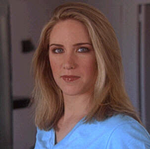
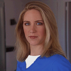
Same shot, different contrast
To recap, when trying to create different looks within the same space use depth of field to enhance the look of your shot and color contrast as necessary. Look at a set-up as an organic whole, like a painting, rather than as a person with a background as an after thought. Your talent does not need to be the brightest part of the picture. Work all the elements together so that you have a good range of texture. Learn how to light for contrast, not color. Remember contrast in your talent's outfit. An elderly, fair-skinned man with gray hair in front of a white wall will look better in a dark suit and light shirt than in a gray suit. Don't face people one way or the other because the last one you shot faced right and you want to have someone facing left. Look at the weight of the shot and think which direction seems to balance the shot. And finally, it's not impossible to make multiple shots within the same location look different. Find all the props you can, try to create different looks with color, and be sure to use a shallow depth of field.
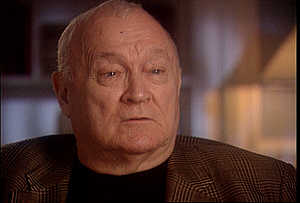
5:The final set-up
In my final set-up, as shown in picture five, I am using all my elements. The talent has light skin with grey hair. I have a slight bit of rim light on one side of his head to accentuate the gray and his dark jacket, but not enough to make it look like it's lit. I have strategically placed lighter shades (near white) around his head to separate him more from the background. I am using a background that is different from any of the other set-ups. To help soften the background, my depth of field is very short. My camera is nine feet from the talent, who is about seven feet from the background. I am also using a color on the background that I have not used before, plain 3200k light. Remember that I'm going for different looks. I can achieve that in two ways: elements that make up the background and the colors I use in the background. I should mention glasses. Another famous line is 'I can't light for glasses that well'. Why not? Glasses are rarely a problem if your light source is soft and from an angle that doesn't catch too much reflection. In my example there is a bit of light reflection. Have you ever spoken face-to-face with a person in glasses and seen no reflection whatsoever? I bet you never noticed! In fact, before I mentioned it, did the glasses bother you? Most would say no. Reflection is A-OK and unavoidable in 99.9% of the cases. I have seen people get infatuated with reflection and try to move their key source so far to the side that it looks like a horror show. If you go into it knowing that in the real world reflection is ok, you'll have an easier time. Of course the idea in allowing reflection is that it is not in the iris of the eye but off to the side. And people don't sit still; they are animated. In my example the talent will turn his head even more into the light causing more reflection. But it will be only momentary. As a result it really isn't a concern to me.
My hope that if you look back at all the pictures, it will appear as if they are all in different locations as that was the goal.
Copyright 2013 by Walter Graff. This article may be circulated and shared as long as the following reference is made: 'This article appears courtesy of Walter Graff- http://www.waltergraff.com'
Please don't hesitate to send me an e-mail if you have any questions or comments please e-mail me at Walter@waltergraff.com