 Down and Dirty Green Screen
by Walter Graff
NOTE: Your computer monitor is not a TV set. The gamma settings of your computer monitor are usually different than a TV set, hence some of the photos may look dark or not as good as they should. Use these photos only as a reference.
NOTE ADDED 11/2003: I have received many emails asking why folks just can't seem to do what I am doing here. All tell me they are trying this with less than stellar DV cameras. I will preface this article by saying if you are using an inexpensive, small CCD DV camera to do a chroma-key, you may be at a disadvantage. Larger 2/3 inch CCD systems have easier times with chroma-keys as do formats that are more robust in terms of signal quality. It's not that you can't do it with DV, it's just that it can be difficult to do more intricate keys with a consumer DV recorder. And the "digitalness" of a DV signal in post adds to the problem as it creates small boxes that represent pictures which means when trying to cut digital DV keys you can get what are called jagged edges that don't look smooth. On top of that the software and hardware configurations you use may also affect quality. There are a number of software plug-ins to help smooth out this problem.
Chroma-keying for television is one of the simplest effects one can do to enhance a production. I shot a direct marketing piece and needed to do a simple green screen for the spot and turned it into an article showing you how I accomplished it.
This was a shot of the talent in front of a green screen in a medium close-up speaking to camera. The first thing one needs for a chroma-key is a colored background material. I use green and blue as my two colors of choice for background. Green will present your talent as sharper when you look at them in-studio than blue as our eyes have a difficult time focusing on blue. That last sentence has noting to do with the quality of how the colors key, just how your eyes see the color and talent in the studio. That might be a factor when you are doing intricate rear screen work and you want to be able to distinguish things easier as you look at them in front of the screen, but it has little to do with the post-production process as either of the two colors will key well.
The material I am using in the still above was purchased for about $100 from a scenic supply shop. It is a pure hue of green sold as chroma-key material. You don't have to spend as much money though. A trip to a local sewing materials/fabric shop will offer you all sorts of blue and green solid fabrics that you can purchase to create the same effect. Very simply you want a solid color with good saturation (pure color).
 It's more knowing how the post works than the actual shoot!
While lighting is important to a good key, the most important thing about shooting a chroma-key has nothing to do with what you do in the studio, but everything you do after the shoot. Hence, to understand how to shoot chroma-keys properly, you must understand the process of cutting a key. I'm not talking about what a textbook says on the subject, rather I'm talking about actually knowing the equipment used to cut the key and how it works. "Cutting the key" refers to the electronic process in pst where you actually put the background behind your subject. You can only learn this from doing it. Today most of you do your work on a non-linear editing system. Hence if you are shooting a chroma-key and you haven't played with the chroma key cutting abilities of your editing system first hand, then you are at a great disadvantage. Very simply knowing how to drive a car and how to get somewhere are two different things. If you have been shooting chroma-keys and have yet to see the final process and how it is accomplished, I strongly suggest you try it before you shoot your next key. Doing so will open up a world of understanding that all the articles in the world can not explain. Chroma-keys are about subtleties and cutting a perfect key can only be completely understood after you've played with the chroma-key cutting controls yourself.
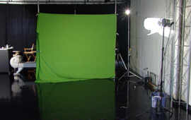
The first thing I consider when shooting a chroma-key is how much area of a colored background I need. In this case I was shooting a small area so I stretched a green material with auto-poles and some spring clamps enough to cover that area. There is no need lighting a 20 foot chroma-key if you're only using 5 feet. What is important is that all areas around your talent are evenly lit. I make sure that any wrinkles near the area where the key is to take place are at a minimum. I don't need to have a pristine ironed background but one that is relatively clean of wrinkles. The only way I know what is acceptable in this case is because as I just mentioned, I have actually done the post-process and I know the intricacies of keys and what I can get always with. Wrinkles are not your friend.
The Green Monster!
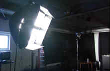
I consider two elements when lighting a screen. One of the most important considerations is maintaining the value of the chroma key color. In other words, taking a green background and lighting it with a whole lot of light effectively making it look like a washed out green is not the way to light a screen. Rather all I am trying to do is take the color and enhance it with light so it reads evenly on camera. That means I actually don't need much light at all. In this case, all I needed to successful light my screen was two 600 watt open-face fixtures with 216 diffusion clipped to the front of each fixture for better light dispersion. The fixtures were placed equal distance from either side of the background. In this case they were about 15 feet from the screen.
I normally light screens with less light than the talent. I will not tell you how many stops of light the difference is as I do not believe there is a universal formula. It's what works at the time. But I will say that when you light a person and screen properly the difference in the screen levels and the person usually turn up to be about the same with the person being anywhere form one stop over to one stop under the screens level. You can always have a screen that is a stop or more under as that will mean less reflection and potential problems.
The second consideration for a good key is smooth, even illumination. There are a number of ways of determining this. Looking through a darkened piece of glass (gaffer glass) or dark gel will help you see variables slightly better than your naked eye. A light meter will allow you to see variables across the front of a screen. A spot meter will do it too but requires some practice. A waveform monitor is the best method as it will show you how even your lighting is with no room for inaccuracy. The simplest method and the one I used here was to rely on the exposure zebras in the view finder. Irising up and down causes the zebras to glow giving me a sense of what part of the screen is brighter than the other. I can then adjust the lights so that when I apply the zebras again, I get a more even exposure. Once again, knowing what I can get way with from having first-hand knowledge of the keying process allowed me to realize how even my screen has to be. Was it 100% even in this case? No, but I know what level of evenness would cut properly in post from having experienced it in the past. Notice in the photo below that my screen isn't exactly even in terms of illumination, rather it's a bit darker over the talents left shoulder and gets a bit darker going down that side of his body. I knew that, but also knew from having experienced trying to cut many keys in the past that it's perfectly acceptable in this case. You would have to experiment to know what is acceptable to you.
 Time for the talent! Link to talents web site.
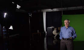
So I've got my screen where it's going to do the trick and now I need to light the talent. Yes, I light my screen first, then turn it off and light my talent separately. Read on! Lighting green screens is actually about lighting two elements as if they had little to do with each other. In other words, when I light a green screen (could be blue too) I light the screen making sure it's properly illuminated, and then I light the talent, not for how he looks in front of the screen, but how he is going to look in the imaginary setting I'm going to put behind him. In order to do that properly, after I light the screen sufficiently, I turn it off and light the talent by him/herself.
I always try to make sure my talent is far enough from the screen so as not to allow any color from the screen to spill onto the talents skin potentially causing problems later in post. In hits case the talent is about 15 feet in front of the screen giving me plenty of separation.
There is no hard rule but the more distance you can separate the talent from the screen the better chance you will not have problems of reflection, etc later.
 Isn't that easier on the eyes?
Look at the photo above and the photo above that. Notice the difference? It's much easier to see how the talent is lit when the green screen is turned off. And since the two elements (screen and talent) have nothing to do with each other while shooting, I say turn off the screen so you can concentrate on your talent.
 Key light for the talent
If I was to light my talent just to make him look good for the moment I'd be missing out on what is most important; the element that will fill-in my background once the key is applied in post. In other words I have to use my imagination now and pretend that the background element has been inserted and my talent is being seen in that 'set'. So imagine that I am going to have my talent in front of an exterior shot of a bridge on a bright hazy day. First I need to know what the background element looks like. In this case, I notice the sun coming from the distance to the right of the background element. So my first consideration for my talent is where the back light (if any is needed) will go. Did I actually say 'if any is needed'? Yes. Sometime long ago in a far away galaxy someone created the myth that in order for a green screen to work, you need to surround your talent with lots of back light. And through the years all sorts of other mystical stories were added such as 'lighting with orange gel', 'never using colors for back light., etc. While this may have been true in 1970 when keys were first invented, in years past new and more sophisticated equipment has made cutting keys easier. As far as I am concerned, the only determination as to what I use as a back light is what the final composite is going to be and what pleases my eye. And as for colors? As long as I don't use a green light on my talent (in this case because I have a green background), I can use any color I want.
 Example of a final composite
Just another note about the term 'ratios'; I hear all sorts of folks talking about ratios of foreground to background with video chroma-keys I think they are trying to make a science out of something that isn't that difficult. The bottom line is that if your background and your foreground fall comfortably within the range of acceptable exposure (they will naturally if you light your green screen for hue and your talent as explained above), I don't think there are any rules to this ratio 'thing'. I do seem to light my screens slightly darker than talent but that is because I am trying to illuminate color, not create a bright screen. In other words, when I am done I have extenuated the green color, not made it a brighter shade of gray.
Remember, effectively your background and foreground are two different things. I may have a final product that will be my talent standing in front of a star field. What does a foreground background ratio have to do with that? Whatever works! My background needs to be illuminated so as to be even and represent the true hue of the color material I am using (blue or green), and my talent needs to be lit not for any relationship to the background color but to the background plate that is to be inserted later. If it was a star-field, I might light my talent a bit more from one side and depending on the darkness of the background, I might give him a kicker type back light, from one side or a 'down the middle' back light. It's all about personal taste, but simply surrounding a person with back light. is one of the first clues that he is not part of the background element in many keys I've seen that didn't look good.
In the composite shot above, I used a bridge shot (the East River Arch over Hellgate in Queens, NY) for this example although in the real commercial that was not the actual plate we used, but it works for the purposes of this demonstration. In fact, something interesting is demonstrated. Notice the sense of sun coming from the right side of the background image (the bridge shot). See how the back light on the same side of the talent helps to make him look more appealing when placed in front of the picture as if he is really standing in front of a bridge with the sun hitting his shoulder as it does the bridge?
 Lighting diagram
So to recap what I said-
1. Light your screen for it's hue and not just to make it bright. It doesn't take much to make a screen glow evenly.
2. Light your screen as evenly as possible. (first hand experience trying to cut a key in post will make that skill more of a skill and less of a guess).
3. Make sure your talent is far enough from the screen as not to have any reflections on his cloths or face from the screen. Don't freak out over this. Many folks tell you that you need to be as far ways as possible form your screen. This is false. A properly illuminated screen will not reflect light like a mirror. See my DVD to understand this.
4. After lighting the screen, turn it off and light your talent.
5. Light your talent not to make him look good in the moment but as if he was standing in whatever the background plate is going to be. If he was standing in front of an underwater background, light for that. Example of fun effect: you could try taking a dish of water, aiming a light at it from a low side angle, making waves with your hands, and allowing the ripples to move across your talents face creating a water motif to his shot that might work well with the background.
6. Back lights are dependent on nothing more than taste and how they work into your background. In that water example you might have streams of light coming down from on side of the background plate as if we could see the beams of sunlight in the water. Whatever side that light is coming from, I might put a back light. from that angle. You can use gels for back-lights as long as they are not too similar to the color of your background. Sometimes hair is shiny to the point where the background color might reflect a bit. Try a color to help eliminate the color cast from the background. For example, a straw gel on blonde hair might help eliminate some of the green tinge if it's a problem.
7. Color on anything in front of the screen can be what you want it to be as long as it's not too near the hue of the background color. It's best to stay away form sky blue-type colors if you are using a blue chroma key material.
8. All these things mean so much less if you haven't experienced creating the actual effect at least once. If you have your own edit system, take some time to play with the chroma key controls and see what it takes to cut a clean key. That will give you a better understanding of the intricacies of shooting a chroma key. If not, visit your edit room and ask the editor to show you how it all works.
END OF ARTICLE
If you would like to learn more about green screen, Disk #008 in my series titled "Green Screen For Idiots " is now available. This one hour and 40 minute disk walks you thorough a real-world green screen TV commercial that is shot and produced by Walter Graff showing you everything from set-up to post production. It is a must for anyone wanting to learn all there is about the nuances of lighting, shooting and editing green screen. Click here to learn more.
Copyright 2013 by Walter Graff. This article may be circulated and shared as long as the following reference is made: 'This article appears courtesy of Walter Graff- http://www.waltergraff.com'
Please don't hesitate to send me an e-mail if you have any questions or comments please e-mail me at Walter@waltergraff.com