Lighting Darker Complexions
by Walter Graff
NOTE: Your computer monitor is not a TV set. The gamma settings of your computer monitor are usually different than a TV set, hence some of the photos may look dark or not as good as they should. Use these photos only as a reference.
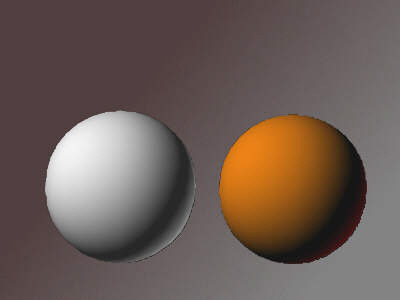
Say I was to give you two table-top set-ups to light. The first set-up consisted of a brown seamless background and a white foam sphere. The second set-up consisted of a white seamless background and a brown foam sphere. What would you do? Let's take a look at each of these set-ups and I'll tell you what I would consider and relate it to the real world.
Let's tackle the first set-up, a white sphere on a brown seamless background. First off, I know I need a balance here between the two. I want to maintain the integrity of the white sphere's whiteness without pushing it over the limits while giving the sphere some texture so that it reads as a sphere. I also want to find a range where the brown background compliments the sphere. Since my sphere has no sense of depth, I am going to give it depth by lighting it more from one side or another creating a moon-phase effect where the sense of shadow allows the viewer to see that this is a sphere and not a flat disk.

Without texture life is just a dot
Now I need to figure out what I am going to do with my background. Just as the white sphere was a boring looking disk before I lit it, the background is a boring solid brown color. So I am going to work with light and texture it to create a sense of irregularness to the way the light is falling and doing so will give the solid color a sense of texture and depth. In many cases I'll aim a light at the seamless and use some form of break-up to create shadows an highlights. Or in this case, simply aim the light hitting the background somewhat on the background and mostly off to create a gradient look.

What a difference a little bit of shadow makes
Although my simulation above isn't the greatest, I'm too lazy to shoot the real set-up, but I think you get the idea. I've lit the sphere so it is represented as a sphere and textured the background so that is has a appeal and compliments the sphere. And now we light the second set-up; the brown ball on the white background.
Without light you'd never know it's a sphere and that it exists in a three-dimensional space
In the example of the white sphere on the brown surface, I created a sense of shadow and depth on the sphere and lit the background to compliment the sphere. With the brown sphere on the white background, I do exactly the same.
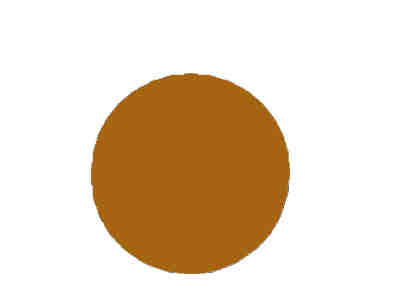
The first thing I am going to do is to create the same sense of depth to the sphere as before by lighting the sphere primarily off center. And in this case, the sphere is brown instead of white so I probably don't need as much light to create the same effect.

Now it's looking more like a sphere
Next I need to light my white background. Guess what? Lighting the white background will be no different than lighting my brown background other than that my intensities will reflect a complimentary relationship of the background to the brown sphere.
A much better representation of the brown sphere with a textured white background
So what did you just learn and what does it have to do with real people? To answer that we'll look at the similarities of how I lit the two set-ups and the differences. The first similarity is that in both set-ups, lighting wasn't just about the white sphere being white or the brown sphere being brown but about the relationship of both to their corresponding backgrounds just as each background and how they were lit was not about the backgrounds by themselves but their relationship to the spheres.
So lesson number one is that lighting a set-up is about the parts first and then the relationships of the parts to the whole.
Secondly in both set-ups regardless of the color of the sphere I was trying to create a sense of depth to the sphere. Doing that required me to figure out where lights needed to be placed in order to create a pleasing sense of three dimensional depth to the subject.
So lesson number two is to create depth to your subject and compliment your subject with the other elements in the frame.
And now for the differences.
Did you get that?
The differences?
Let me say it again.
OK?
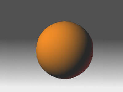
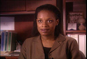
If you didn't understand my explanation of the differences, let me bring it into the real world. Look at the real world photo representing a white sphere below.

He's really a light colored sphere on a brown background
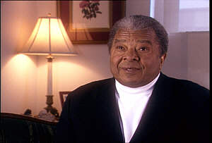
And here is a real world example of the brown sphere.
Brown sphere on a light background
So what were the differences? The differences between lighting a person with fair complexion compared to a person with a dark complexion in my book is that there are as many differences as there are differences in lighting a group composed entirely of lighter skinned people. In other words, it's not about light or dark but about what works for the person. I light a person no differently because they are light or dark, but rather for the setting they are in, what they look like and how it all meshes together.
Notice something about the two photos above. In the photo with the lighter skinned gentleman I use a darker background to help give him some punch rather than putting a lot of light on his face and in the photo of the darker skinned gentleman, I lit the lighter background less to give him some punch rather than trying to illuminate him with more light. As a reference both men are actually lit with about 40 foot-candles of light.
Or look at it this way, if you had a brown sphere next to a white sphere and both were in front of a medium grey background, would you put more light on the brown sphere than the white to make it compatible with the white sphere? I say no, you'd light the white sphere for what makes it look good, light the black sphere for what makes it look good, and find a happy medium with the background that compliments both. In the example below, notice that both have about the same amount of light and that the gradient background id simply a bit darker around the brown sphere than it is around the white sphere.
Each sphere is lit for it's own qualities and the background to compliment those qualities.
In the example below, I wanted to show that darker skin complexions don't need to be made brighter than they exist in real life, but that a background with brighter elements can also be used to compliment talent. In addition, I am using warm tones around the inherent warmness of the darker brown complexion to emphasis the richness of the skin color. In some instances I might find that someone's skin simply soaks up all the light I can muster. In instances such as this, I don't add more light. Rather, I find a little foam core card used off to one side so as to reflect a bit of light off the cheek or neck to the camera lens sometimes alleviates the problem. Other times I find I need to make sure the background immediately around that persons head isn't too bright as to make his or her dark skin tone contrast even more with the background.
It's about the frame as a whole, not just the individual elements.
I often find that when working with people of African American descent that blue is a nice contrasting background color. Of course it all depends on my mood, but many times I find myself working with the blue tones when dealing with African American skin tones. Below is an example of where I let the blueness of an exterior window blow out in the background. I like the contrast to the talents skin color.

Dark brown skin and blue are complimentary.
What about dark skin and light colored clothing? Many say it's a no-no. If I had my choice in life, I'd probably want to avoid it, but many times you simply don't have the option. What happens in a worst case scenario where your talent is dark skinned and he's wearing a white and black outfit? Not to fear. Look at it this way, what color is white and what color is black? I don't try to change a color from what it is in life as much as find elements in the frame that compliment the color. In the example below, I light the talent with a bounce as a primary key and let the white and black fall where they will. If the white became a problem, I might stick a little bit of a flag or net across his chest to block or diffuse some of the key light hitting the white shirt to help alleviate the brightness. To help alleviate the extreme contrast of his sweater to his shirt I added contrasty elements into the background and kept the background illumination levels higher than I might in other cases. Notice the bright lamp with the dark picture frame and the walls which I kept in middle grey. I almost recreated the three tones on the talent in the background. Allowing some of the backgrounds values to have higher peaks of white helps to diffuse the contrast of his clothing.
Contrast doesn't have to be a problem
Let me finish off with an example of a headshot involving a person with a dark complexion and what I did. During the day I shot this we were way behind schedule and I was forced to complete the set-up you see in 15 minutes time so what I show here isn't everything I might have wanted to do but it is good enough for the purpose of our demonstration.
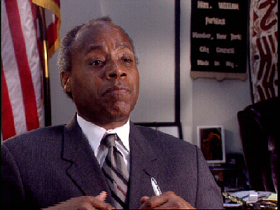
New York City Councilman Bill Perkins
For this shot, I faced a bit of a problem coming into the room; I could not shut off the overhead lights. In some instances I might disconnect the tubes from the fixture, but this was a down and dirty interview and time was limited so I worked around the lights. And while you can't tell it from the picture, I have little to no room to move around in this space as it was very small.
I used a 600watt Lowel Omni light that I focused into a 36" flex-fill for a key. I also added a 8 watt fluorescent (my Graff light I made out of a fixture from the Home Depot) which acted as a fill light as I felt his face went too dark without it. As a backlight I came up with a time-saving solution. I wanted to give the wall behind him a bit of a breakup with light. So I used one fixture to do that and allowed it to become my backlight also. I focused the fixture through a foam-core cookie that I made for the background and allowed the bounce-back to become his hair light. I would have probably gelled the light hitting the wall with a bit of 1/2 CT Blue (Lee202) but the fluorescent fixtures gave the wall a blue tinge so I instead left my Prolight hitting the wall a warmer color temperature for some color contrast. Notice the black line down the wall. I added that with a piece of gaffers tape. It helped me create a line that balanced out the frame on either side of the talent.
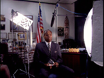
This should give you a better reference of the room
And here is a diagram of the set-up.

To sum up what I discussed:
1) Just because someone has a darker complexion does not mean they need to be lit with more light.
2) The same rules used in attempting to create a sense of depth apply to dark skin as it does for lighter skin. It's about what makes the individual look good, not some rule about light skin or dark.
3) It's also always about the relationship of everything in the frame, not just the talent. Sometimes a lighter background helps a darker complexion, and sometimes a darker background is more suitable. It's about what works for that particular individual.
4) Lighting a background to compliment the texture and color of your talent makes for a more appealing frame as opposed to lighting a person for who they are and throwing some light up haphazardly on the background just to illuminate it. The relationship of your talent and the environment is just as important as how the talent looks. Sometimes warm backgrounds work, and other times cooler colored backgrounds compliment the talent best.
5) Everything is about how it looks in the moment. There are no rules in life when it comes to lighting, only guidelines.
Copyright 2013 by Walter Graff. This article may be circulated and shared as long as the following reference is made: 'This article appears courtesy of Walter Graff- http://www.waltergraff.com'
Please don't hesitate to send me an e-mail if you have any questions or comments please e-mail me at Walter@waltergraff.com