How To Use Your Environment To Enhance Your Lighting
by Walter Graff
Note: A computer screen does not always reproduce pictures the same way as a television screen. Your computer monitor may not have its gammas set properly and as such images here may look darker or lighter than they really are.
For me, it’s not about lighting, or filters, or camera adjustments, or setting, but about a little bit of everything. I light to look nice. Use the internal camera adjustments to enhance that, and the environment to further take the shot places, but make no mistake, good lighting starts with an appropriate atmosphere whether it’s a dramatic feature or a corporate shoot.
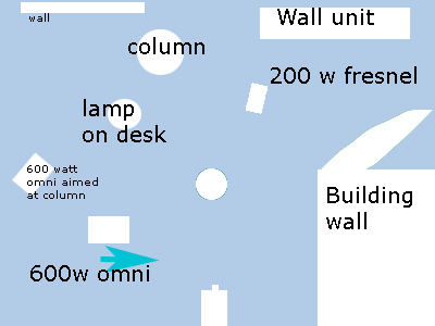
I recently did a shoot with designer Chris Madden. I had two set-ups with her on camera; an interview and a pitch to lens. In both situations I let three things help me a great deal; color, depth of field and anything I could find in the room to use in the background that made her look good. Notice out of three only one is about lighting. So first let’s look at the lighting. As before, I am trying to be simple, but at the same time, effective. And yes, I also only brought three lights with me, two 600 watt open face fixtures, and one 200 watt fresnel. Actually I’m cheating here. The display room we were in had a portable lighting set-up to cast color on the furniture and in the end I used a few of the lekos hanging from the ceiling to further help me out. First lets look at the lighting plot and the camera view:
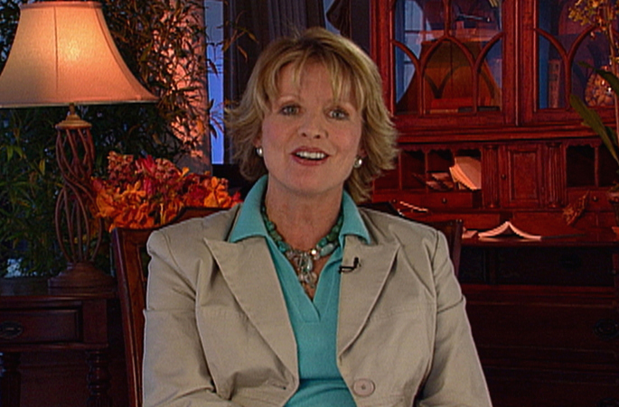
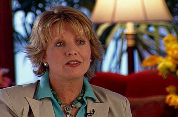
First thing I have to ask is what makes this shot look appealing to you? To me, it’s color and form. Color as in the rich palette of colors from her clothing to the flowers, the warm lamp behind her, and the wood tones, all the way to the blues peaking through in the background.
In fact if I look at her alone, she’s exactly what I want her to be, Chris Madden looking like a person I’m talking to, not a person who looks lit. And once again I like my women soft. So to accomplish that I use a 600 watt open face and instead of setting up a bounce reflector, I simply use the wall that is out of the shot on the right to help make for soft bounce light. And I also let that open-faced light spill onto her from the left so that when you look you see that she’s lit very evenly. I like that. And just to make her separate from the background I have a 200 watt fresnel on a dimmer that shows as the light on her head and shoulders. And I also like more than less of a bloom with a backlight for women than men.
But there is so much more going on her than just how she’s lit that makes her look great. Let’s start with color contrast. I think I talked about it before. Color contrast is about using complimentary colors from different ends of the spectrum. Red vs blue is always appealing. Some colors are opposite and complimentary to each other and in this case we have a few pallets working for us; earth-tones and warm and cool. Designers like Chris use color palettes all the time and so do we in lighting.
It’s the combination of Chris’ blue shirt that delineates her skin tone from the jacket tone which shares the same overall tonality with her face. It’s what separates her outfit from being a uniform, or what it is a complimentary way for her to dress.
And that palette of warm wood behind her makes her paler tone stand out yet look comforting. And in that wood is the subtle contrast of brown and yellows that I use from the flowers to the lampshade to the orange light I washed the desk and pole with that give the shot depth.
And finally within that warm wood background it’s, me continuing the theme of her earth tone/blue outfit.
I do that by putting in small leaks of blue light within the background. For instance, I let reflections of the outside daylight enter and reflect on the glass of the wall unit. I also throw deep blue light using one of the lekos that exists there already on the back wall on the left side of the shot (It’s the slit of blue light on the left).
And what would all that light be without the props. The lamp (not on dimmer, rather deliberately blowing out at its hottest spot) and table were put there by me. The thin leaves of the plant behind it that is revealed by me from it slashing orange light on the column behind it makes for a nice way of showing foliage without having to use green gels. Who says leaves have to be green. Can’t they just be shadowy and more like a light break-up? I choose the plant on the table and I used an amber gel in one of the house lekos that I aimed at the plant to get the warm colors to pop.And what I have created is a warm inviting atmosphere where lighting helped but in reality it was the props and furniture and the placement so as to have a balanced frame that really make it inviting along with a palette of color. The point is that lighting is part of the equation but without the right elements to light that background all you have is slashes of light and that to me that is boring lighting. The finished shot is below once again.
In a different setting, I had to do a set-up with Chris looking off-camera. And once again it’s so not about the lighting and more about the right setting and using the lighting to make what background elements I’ve got to work for me. People might say its nice lighting but they don’t realize it’everything but.
The best thing about the location was that it had the entire line of furniture that Chris Madden makes to work with so it meant I could make for some nice backgrounds.
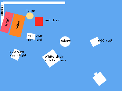
As you look at the plot above notice that it’s not just the lights I used but also includes the other elements I used including a table with flowers, a hutch, red chair with wings, a lamp, plant, and an uncorrected window person who looks lit.
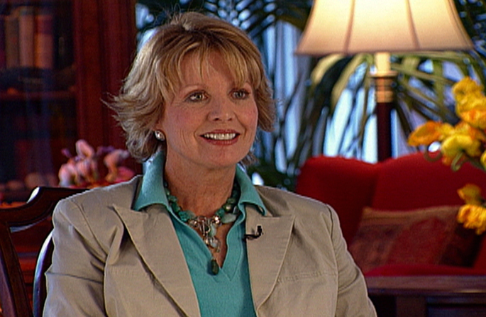
Lighting wise it’s similar to my last sep-up. I don’t like women to look very modeled so she’s lit rather flat with the spill of an open face fixture that is also aimed at a white chair. A chair? Yes, there was a white tall-back chair there. I could have used a reflector but the chair offered two white angles to reflect from which lit her neck giving her an even nicer feel. Sometimes when you come from a bit below the talent, it adds a bit of a different look that can be appealing. I once gain used a 200 watt fresnel with CTB gel to give her hair a bit of bloom that made it match the window background as if light is spilling in from the window. And I washed the furniture behind her with an orange gel on a 600 watt open-face fixture.
But what makes this shot work for me is once again two elements that are not about lighting; depth of field and color contrast.
First off, my camera is a good 20 feet from her. And she is about 25 feet from the background elements which are another 20 feet from the window. What that means is I have very shallow depth of field. And that makes the background soft, and soft is beautiful.
And as for color contrast, I’ve got a rich palette of colors that make for a very warm and appealing shot. It’s three main colors as I see it, blue red and yellow. From the window light which surrounds her head making the warmer tone of her skin pop, to the palette of soft reds and browns in the furniture to the yellow highlights of the flowers and light fixture, it’s one of my favorite setups I’ve done recently. Two frames are shown below and below is a link to see what both look like in motion in a clip where I threw together the two shots.
Here is a link to see the pictures move (2.5meg file). They are short clips with no sound just to give you a better represnetation than these captures do. You need QuickTime to view which you can get free online.
Copyright 2013 by Walter Graff. This article may be circulated and shared as long as the following reference is made: 'This article appears courtesy of Walter Graff- http://www.waltergraff.com'
Please don't hesitate to send me an e-mail if you have any questions or comments please e-mail me at Walter@waltergraff.com